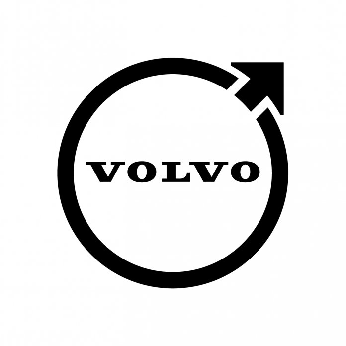
Fans of Flat Stanley — and users of the internet — should be rejoicing as Volvo joins the trend among automakers to flatten its corporate logo.
The dezeen.com website reports that Volvo has redesigned its Iron Mark emblem, streamlining the styling, eliminating the blue and silver colors for a more web-friendly, two-dimensional design.

The report quotes a statement from Volvo: “The iron badge on the car was supposed to take up this symbolism and create associations with the honored traditions of the Swedish iron industry: steel and strength with properties such as safety, quality and durability.”
The new logo will be used on Volvo vehicles as well.
PS: For those of a certain age who may not be familiar with Flat Stanley, he was the subject of a children’s book first published in 1964 about the adventures of Stanley Lambchop, a boy who was flattened in a bedroom mishap but survived and discovered being flat allowed him to enter places other children could not enter.
Annually, as part of their geography education, school children draw their own Flat Stanley characters and photograph them as they or their friends and relatives travel around the US and the world beyond.


