Peugeot’s visit to the American automotive marketplace was short-lived, but it was fun while it lasted. Basically, it lasted from 1958 until the summer of 1991, and in addition to Columbo’s 1959 403 cabriolet, there was the much-later 405 Mi 16 and even the 505 Turbo wagon. Though, alas, not the 205 GTi hot hatchback.
But who knows what the future might hold, now that Peugeot and Citroen and Chrysler and Jeep and Opel and Dodge and Maserati are all one, big happy Stellantis family.
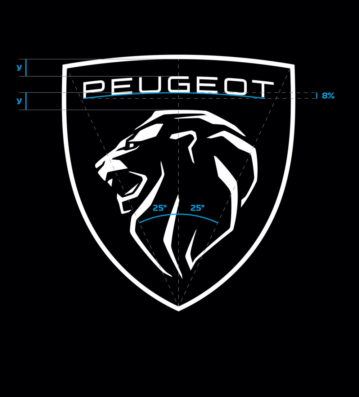
Which brings us to today’s news from Peugeot and how it has taken a different tack in devising a new corporate logo.

There’s been a tendency of late for automakers to issue new emblems. Among them are Kia, Vauxhall, Mini, BMW, and Nissan. Even General Motors has changed its image and, of course, Stellantis had to create a logo for itself to provide an umbrella over its 18 brands.
Now it’s Peugeot’s turn. Like Vauxhall, Peugeot retains its animal mascot, though only the lion’s head remains part of the new logo.
In fact, “Lions of our time” is the new mantra for the brand which introduces the logo as part of its move upmarket within the Stellantis framework. Peugeot now identifies itself as “an innovative high-end generalist brand.”
Like the other new logos, one motivation was the digitalization of information around the world. Keywords for the Peugeot and its new image are “quality,” “timeless” and “assertive,” we’re informed.
The word “Peugeot” is now presented as “PEUGEOT,” in all caps, by the brand, though we will continue to report things Peugeot in the tradition of capitalizing only the “P.”
“With over two centuries of history, Peugeot is a pioneer of mobility and a legendary brand for automobiles and bicycles,” Peugeot’s design director Matthias Hossann is quoted in its announcement. “This emblem and this new brand identity are a link between our history and our vision for the future. This logo has been conceived, designed and developed in-house with the same stringent requirements that we apply to every detail of our vehicles: the quality of materials, the quality of execution and the quality of the finish.”
According to Peugeot’s announcement, “The profile of the lion’s head has established itself as a powerful indicator of feline grace and identity. It conjures up pride, strength and status, without aggressiveness. The shield is a protective, timeless element, faithful to the history of the brand since 1810. Its symmetry integrates it perfectly with the radiator grilles of the cars.
“Its design, as if cut by laser, uses the sharp and faceted style of the latest Peugeots. The choice of the black background makes the Lion appear lit from above. This 2-D logo is part of the flat design trend, enhancing minimalism and pure lines. It is perfectly adapted to the digital world.”
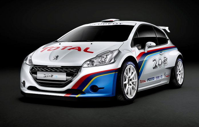
Now, if Peugeot only would send over the 208 Type RS.


