
The debut this week of the BMW i4 electric concept car provided a look not only of the future of driving but, more immediately, the future of the BMW brand.
Perched on the prow of the i4 was a fresh redesign of BMW’s corporate logo, which dates to 1917 and has not been modified since 1997. The new look retains the familiar form of the world-famous brand but in a distinctly modernized form.
Gone is the distinctive black band that surrounds the blue-and-white checkers, and which has been present throughout the logo’s history. That is replaced by a transparent space with a white rim in which the letters BMW are placed. The look is flat, a current trend in logo design, with the color of any background showing through.
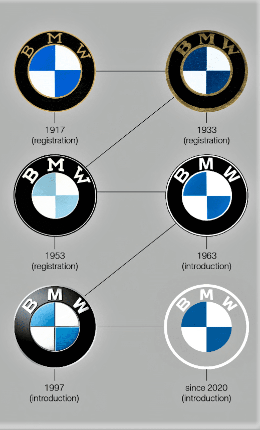
The German manufacturer plans to retain the existing logo on its vehicles or dealerships while using the new one in communications and marketing. Part of the reason for the change is an improved appearance in digital depictions.
“The new design is an expression of the revised brand identity, which places the customer at the center of all activities,” BMW says in its description of the new-look design. “Pared-down and two-dimensional, it conveys openness and clarity.”
BMW recently debunked the longstanding belief that its venerable logo represents a spinning propeller, noting that it actually was created in homage to the flag colors and design of its home state of Bavaria.
BMW is expected to roll out its new-look logo during the next few months, the company said.

A bad, bad idea.
You own one of the most recognizable logos in the history of logos.
You have a century long record of producing some of the most excellent and identifiable products attached to this logo/emblem.
Then, ad wonks, IT “professionals”, and people who have never driven an automobile decide to “upgrade”.
Sigh.
Just stop, ‘k?
Don’t. Please.